Leanote博客添加过渡动画

为了提高博客用户体验,我们可以为其添加一些动画效果。这篇博文主要介绍如何添加页面切换动画以及页面加载动画。需要用到的插件:

Animsition.js:http://git.blivesta.com/animsition/

Loader.css:https://connoratherton.com/loaders

页面切换动画

首先从https://github.com/blivesta/animsition上下载插件包,解压后在博客主题中引入animsition.css和animsition.js:

1
2
<script src="{{$.themeBaseUrl}}/animsition.js"></script>
<link href="{{$.themeBaseUrl}}/animsition.css" rel="stylesheet">

这里不引入压缩版的原因是为了方便待会修改源码。 然后找到博客主题中的body标签,添加 class="animsition"

1
<body class="animsition">

接着找到博客主题中所有的a标签,添加class="animsition-link"。 最后调用Animsition动画:

1
2
3
4
5
6
7
8
9
10
11
12
13
14
15
16
17
18
19
20
21
$(document).ready(function() {
$(".animsition").animsition({
inClass: 'fade-in',
outClass: 'fade-out',
inDuration: 400,
outDuration: 400,
linkElement: '.animsition-link',
loading: true,
loadingParentElement: 'html',
loadingClass: 'line-scale-pulse-out-rapid',
loadingInner: '',
timeout: false,
timeoutCountdown: 5000,
onLoadEvent: true,
browser: [ 'animation-duration', '-webkit-animation-duration'],
overlay : false,
overlayClass : 'animsition-overlay-slide',
overlayParentElement : 'html',
transition: function(url){ window.location.href = url; }
});
}

inClassoutClass指定了页面载入和离开时候所展示的动画,这里使用淡入淡出的效果。Animsition提供了许多动画效果,可根据自己的喜好更换。inDurationoutDuration指定了动画的持续时间,单位为毫秒。linkElement指定超链接元素,这里是我们上面添加了class="animsition-link"a标签。

页面加载动画

Loader.css是一个纯CSS加载动画插件。Animsition插件自带的加载动画不太美观,所以使用该插件替换。 首先从https://github.com/ConnorAtherton/loaders.css上下载插件包,解压后打开loaders.css-master/demo/demo.html可看到许多美观的加载动画。选择一个自己喜欢的动画,然后F12查看其HTML源代码,比如:

46142895.png

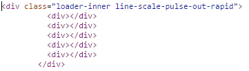
从源码中可知道,这个动画对应的class名称为line-scale-pulse-out-rapid

然后修改一开始引入的animsition.js,找到并修改addLoading函数:

1
2
3
4
5
addLoading: function(n) {
var html = '<div class="' + n.loadingClass + '">';
html += '<div></div><div></div><div></div><div></div><div></div></div>';
t(n.loadingParentElement).append(html);
},

这里loadingClass属性名称是在 $(".animsition").animsition({})函数中指定的,细心的你可能会发现,我已经在上面的例子中将loadingClass属性值指定为line-scale-pulse-out-rapid了。

接下来修改animsition.css,找到和.animsition-loading有关的代码:

1
2
3
4
5
6
7
8
9
10
11
12
13
14
15
16
17
18
19
20
21
22
23
24
25
26
27
28
29
30
31
32
33
34
35
36
37
38
39
40
41
42
43
44
45
46
47
48
49
50
51
52
53
/* loading option */
.animsition-loading,
.animsition-loading:after {
width: 32px;
height: 32px;
position: fixed;
top: 50%;
left: 50%;
margin-top: -16px;
margin-left: -16px;
border-radius: 50%;
z-index: 100;
}

.animsition-loading {
background-color: transparent;
border-top: 5px solid rgba(0, 0, 0, 0.2);
border-right: 5px solid rgba(0, 0, 0, 0.2);
border-bottom: 5px solid rgba(0, 0, 0, 0.2);
border-left: 5px solid #eee;
-webkit-transform: translateZ(0);
transform: translateZ(0);
-webkit-animation-iteration-count:infinite;
animation-iteration-count:infinite;
-webkit-animation-timing-function: linear;
animation-timing-function: linear;
-webkit-animation-duration: .8s;
animation-duration: .8s;
-webkit-animation-name: animsition-loading;
animation-name: animsition-loading;
}

@-webkit-keyframes animsition-loading {
0% {
-webkit-transform: rotate(0deg);
transform: rotate(0deg);
}
100% {
-webkit-transform: rotate(360deg);
transform: rotate(360deg);
}
}

@keyframes animsition-loading {
0% {
-webkit-transform: rotate(0deg);
transform: rotate(0deg);
}
100% {
-webkit-transform: rotate(360deg);
transform: rotate(360deg);
}
}

这段代码是Animsition插件自带的加载动画,将其删除。然后从loaders.css-master/loader.css中找到和.line-scale-pulse-out-rapid有关的CSS代码:

1
2
3
4
5
6
7
8
9
10
11
12
13
14
15
16
17
18
19
20
21
22
23
24
25
26
27
28
29
30
31
32
33
34
35
36
37
38
39
40
@-webkit-keyframes line-scale-pulse-out-rapid {
0% {
-webkit-transform: scaley(1);
transform: scaley(1); }
80% {
-webkit-transform: scaley(0.3);
transform: scaley(0.3); }
90% {
-webkit-transform: scaley(1);
transform: scaley(1); } }

@keyframes line-scale-pulse-out-rapid {
0% {
-webkit-transform: scaley(1);
transform: scaley(1); }
80% {
-webkit-transform: scaley(0.3);
transform: scaley(0.3); }
90% {
-webkit-transform: scaley(1);
transform: scaley(1); } }

.line-scale-pulse-out-rapid > div {
background-color: #fff;
width: 4px;
height: 35px;
border-radius: 2px;
margin: 2px;
-webkit-animation-fill-mode: both;
animation-fill-mode: both;
display: inline-block;
vertical-align: middle;
-webkit-animation: line-scale-pulse-out-rapid 0.9s -0.5s infinite cubic-bezier(0.11, 0.49, 0.38, 0.78);
animation: line-scale-pulse-out-rapid 0.9s -0.5s infinite cubic-bezier(0.11, 0.49, 0.38, 0.78); }
.line-scale-pulse-out-rapid > div:nth-child(2), .line-scale-pulse-out-rapid > div:nth-child(4) {
-webkit-animation-delay: -0.25s !important;
animation-delay: -0.25s !important; }
.line-scale-pulse-out-rapid > div:nth-child(1), .line-scale-pulse-out-rapid > div:nth-child(5) {
-webkit-animation-delay: 0s !important;
animation-delay: 0s !important; }

将这段代码添加到animsition.css中。这里.line-scale-pulse-out-rapid > div 的背景色是白色的(background-color: #fff),所以我们要将其修改为自己需要的颜色,比如博主将其替换为浅绿色:

1
2
3
4
.line-scale-pulse-out-rapid > div {
background-color: #6db33f;
...
}

最后一步,我们需要修改加载动画模块div的定位方式为固定定位并且居中:

1
2
3
4
5
.line-scale-pulse-out-rapid {
position: fixed;
top: 50%;
left: 50%
}

将上面的步骤依次做完后,在加载包含较多图片的博客或者网络不佳的情况下,我们可以看到如下的加载动画:

30506168.gif

Animsition插件还有添加覆盖物overlay功能,博主没有使用这个功能,所以不再介绍,具体可查阅官方API。

请作者喝瓶肥宅水🥤

0